

Cyber-Brutalism vs. Techwear: Read the Outfit
Your black cargos don't come with an aesthetic diagnosis. When cyber brutalism and techwear share a mood board, everything can start looking like equipment for the same dystopian side quest.
The useful distinction is visual language versus garment function: read the artwork separately from what the clothing can do. Cyber brutalism is a loose visual style, borrowing from neo-brutalism, rather than a standardized clothing category.
Start with the signals you can see, then check the claims you can't. We'll compare origins, appearance, materials, silhouette, and evidence of function.
Cyber Brutalism vs. Techwear at a Glance
Use this comparison as a reading guide for shopping and styling. Neo-brutalism often describes a visual style built around bold, confrontational composition, while techwear is a clothing style with function at its core. Neither label needs to define your whole wardrobe.
In digital design, neo-brutalism has a distinct visual language, but garment performance depends on materials and construction. Here's what to inspect when the labels get blurry:
| What You're Checking | Cyber-Brutalist Reading | Techwear-Oriented Check |
|---|---|---|
| Main attraction | Graphic composition and futuristic atmosphere | Documented garment function |
| Surface details | Harsh contrast, modular blocks, digital distortion | Whether visible features have a practical purpose |
| Buying evidence | Clear artwork photos and print placement | Fabric information and construction details |
| Easy mistake | Calling every neon graphic cyber-brutalist | Assuming straps or black fabric prove performance |
A chaotic anime print can make a cotton tee look futuristic. That artwork tells you nothing about water resistance.
Equally, a jacket can have useful performance features without looking like a corrupted loading screen. Check the product details for evidence of those features.
A garment's cyberpunk appearance isn't evidence that it has technical performance.
When an outfit mixes expressive graphics with functional clothing, describe the mix. Calling it cyber-brutalist streetwear with utility layers is more useful than arguing over which aesthetic owns your knees.
How to Read a Cyber-Brutalist Outfit
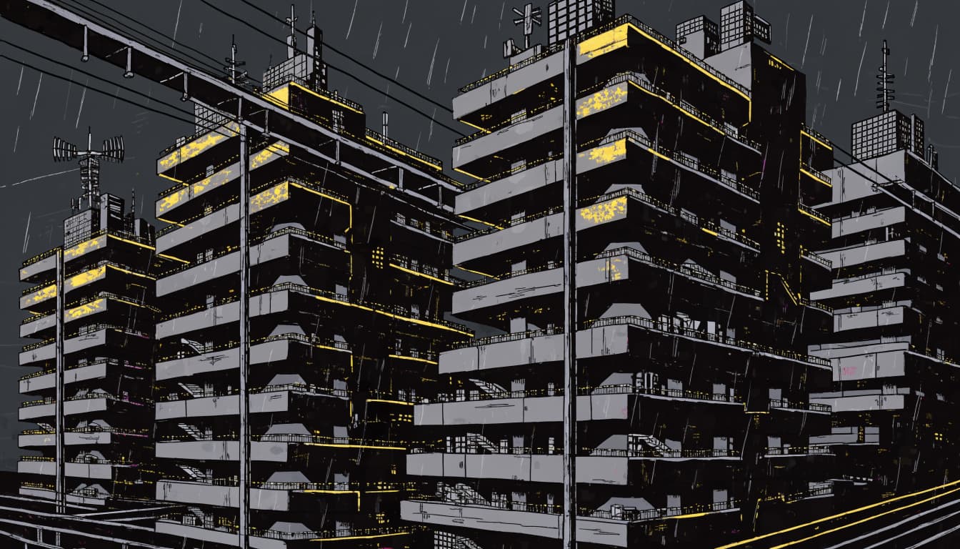
Cyber brutalism becomes easier to recognize when you look beyond "black clothing plus vaguely threatening energy." The neo-brutalism connection shows in the composition, scale, and relationship between human figures and machine-like structures. Those choices shape the visual style.
Read the Graphic First
Look for heavy rectangular layouts, stark contrast, compressed visual space, and imagery that suggests machinery or oversized architecture. Interface fragments inspired by ui design can add a cyberpunk layer and nod to cyberpunk culture, but a random scan line doesn't complete the assignment.
A strong neo-brutalism reference depends on layout and scale, while retro-futurism may share futuristic imagery. The full composition creates the visual language, not one glitch effect.
On a tee, anime artwork can sit inside those rigid blocks. A face, mechanical detail, or manga panel becomes part of a larger graphic system.
The crossover with gamer graphic tees works when both the reference and the composition have a clear point. Recognizable fandom energy beats decorative static.
Read the Outfit Separately
Now ignore the print and examine the silhouette. Loose trousers, a cropped jacket, or a utility layer change how the graphic occupies your outfit.
Those choices can support a futuristic impression without proving anything about performance. A pocket might hold your phone; a decorative strap might accomplish absolutely nothing except surviving the group chat.
Keep those judgments separate. Your shirt supplies the visual story, while the other pieces supply shape, comfort, storage, or weather protection according to their actual construction.
The Concrete Roots of the Aesthetic
Brutalist architecture gives you the physical reference point for neo-brutalism. Britannica's history of Brutalism places architectural brutalism in the mid-20th century and identifies raw concrete and bold geometric forms as defining characteristics.
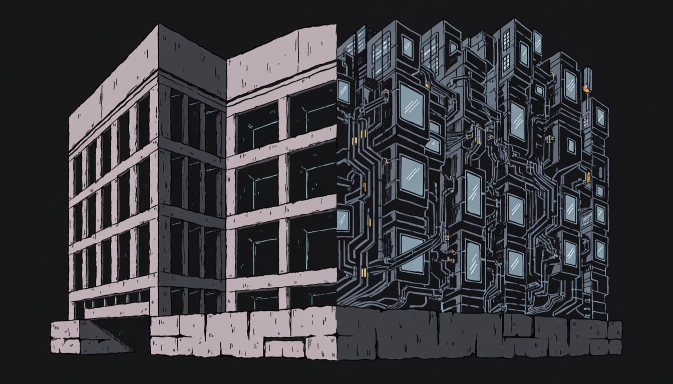
When you study a building, notice its exposed structure, repeated modules, deep openings, and heavy masses. London's Barbican gives you an example of brutalist architecture to examine, rather than another mood board that mysteriously contains twelve parking garages.
For a cyber-brutalist reading, add a technological layer: cables, machine-like systems, artificial light, or dense digital information. Industrial brutalism can inform neo-brutalism here, suggesting a future built over older, stubborn infrastructure.
That distinction matters. Original architectural brutalism concerns buildings, materials, and exposed structure; neo-brutalism in clothing borrows those qualities without becoming architecture. Industrial brutalism is a useful visual reference, not a standardized apparel category.
Concrete also doesn't automatically mean dystopia. You can read an imposing building as civic, sculptural, or welcoming. Cyberpunk imagery adds a particular atmosphere; it doesn't rewrite the building's history.
Why Neo-Brutalist Websites Look Different
Digital neo-brutalism shares some vocabulary with cyber-brutalist imagery, but it has its own visual toolkit. In digital design, a bright portfolio page and a massive concrete housing complex aren't interchangeable objects. The shared name doesn't make an interface a work of architectural Brutalism.
Look for Borders, Blocks, and Bold Color
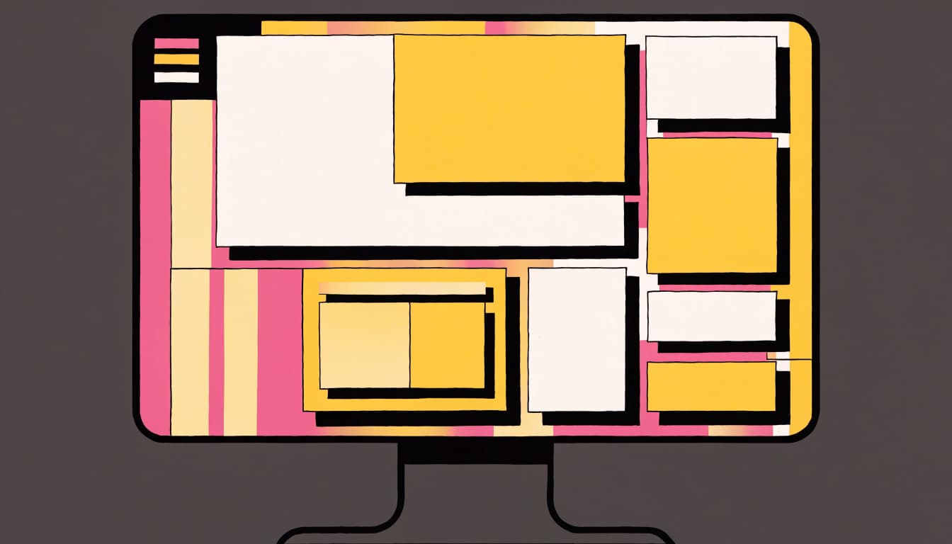
Nielsen Norman Group's neobrutalism guide describes neo-brutalism as raw-looking elements, bold colors, simple shapes, and an intentionally unfinished appearance.
In UI design, you might see thick outlines, flat fills associated with flat design, oversized type, and hard-edged shadows. Conflicting color schemes can make neighboring elements feel deliberately separate.
These cues needn't look futuristic. A cream page with yellow buttons and black borders can read as neo-brutalist without resembling a cyberpunk city. Check the complete composition before treating neo-brutalism and cyberpunk imagery as synonyms. This visual language can appear in web design without suggesting a futuristic setting.
Keep the Interface Usable
If you're applying neo-brutalism in UI design or web design, preserve readable text, obvious controls, and a clear navigation order. A design style guide can keep the visual style consistent without sacrificing usability.
Anti-UX can describe deliberate friction, but it isn't a requirement for neo-brutalism. This design philosophy doesn't mean making routine tasks unnecessarily difficult. Your visitors still need to find the menu.
In UI design, heavy borders can separate content effectively. Competing colors become less helpful when they obscure hierarchy or make labels hard to read. Keep the attitude in the presentation, not in the task of buying a shirt.
What Blade Runner Shows You
Film design helps separate concrete references like neo-brutalism and industrial brutalism from retro-futurism and broader cyberpunk culture. Look at the spaces around characters, not only their coats.
Study the Material Mix
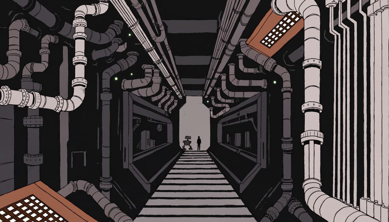
The American Society of Cinematographers' account of Blade Runner's set design identifies industrial designer Syd Mead as the film's "visual futurist." It also describes black marble floors and 20-foot columns.
That mix of materials matters. The film's visual style reaches beyond raw concrete, so labeling every futuristic surface neo-brutalism flattens what you're seeing.
A retro-futurist scene can share the same atmosphere without drawing on brutalist architecture. For a mood board or digital design, inspect scale, layering, and contrasts between people and their surroundings. You can borrow those relationships without copying a character's entire costume. Virtual reality scenes can use similar influences without depicting concrete architecture.
Compare the Pattern Language
IndieWire's production-design interview discusses Dennis Gassner's work on Blade Runner 2049 and its pattern language.
Use that idea when comparing scenes from games like Cyberpunk 2077: which shapes repeat, and how do they organize the frame? Then apply the same question to a graphic.
A repeated block, cropped figure, or large empty area changes a composition's mood. In neo-brutalism, those choices shape the visual language. A neon accent alone can't carry all that work. Your design needs more than the visual equivalent of RGB keyboard lighting.
Check the Garment Before Buying the Label
When a listing uses "techwear," examine its specific claims rather than treating the label as a specification. A neo-brutalism-inspired, technical-looking silhouette isn't proof of performance. You can enjoy the look while asking ordinary shopping questions.
Use this short check before paying:
- Read the fabric composition and care instructions. Decide whether the garment suits your climate and daily routine.
- Examine the seams, closures, and pockets in product photos. Check how they’re constructed and whether you can reach the pockets easily.
- Look for evidence behind weather and durability claims. Check for relevant construction details instead of relying on product photos alone.
Appearance and evidence are separate purchases. Some techwear may prioritize function over form, but a dramatic silhouette can't tell you whether a closure feels comfortable or a pocket is accessible.
Also check whether layers work together. Can you reach your pockets under the jacket? Does the hem catch on hardware? Will you wear the outfit comfortably for several hours?
Your commute shouldn't require a tutorial boss.
Streetwear & Casual Styling
You can wear the cyber-brutalist look without dressing for an imaginary extraction mission. Build your casual outfit around TrendReactTees' signature Cyber-Brutalist Anime Graphic Tees, then give the artwork room. The graphic sets the aesthetic; your clothes don't need to function like technical gear.
Build Around the Tee
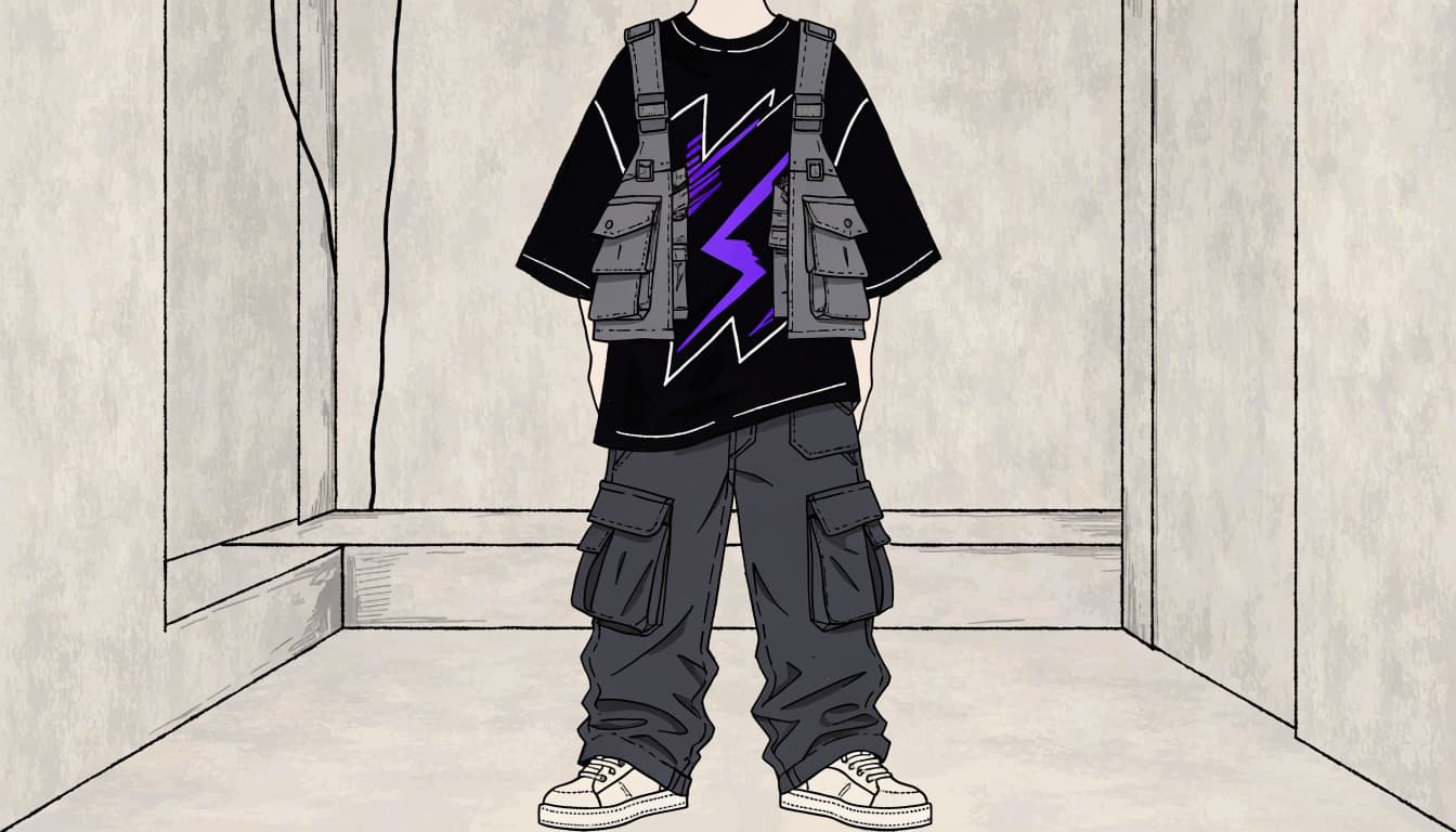
Pair bold anime artwork with relaxed charcoal cargos or dark-wash denim. The print's visual language can draw on neo-brutalism, while the quieter lower half gives it a clear backdrop.
If your graphic includes a bright accent, repeat it once in a small accessory. You don't need matching neon shoes, socks, bag, and existential emergency.
An open overshirt or jacket frames the design without covering it. For more combinations, black and white graphic tee outfits give you a useful starting point.
Check the print placement before choosing your layers. A jacket opening that cuts straight across the main artwork can make the whole outfit harder to read.
Keep Utility Pieces Useful
Choose a messenger bag because it carries your stuff. Pick a vest because you like its shape or need its pockets. Hardware earns its place when it helps you or improves the composition, not just because the graphic references neo-brutalism.
Sneakers keep the outfit casual; boots make it heavier visually. Either can work without a pile of dangling straps attempting multiplayer matchmaking.
Balance the silhouette, too. A roomy tee works with relaxed trousers, but excessive fabric everywhere can swallow the graphic. Try the outfit together before deciding that another size up will fix everything.
Leave some visual breathing room. Your anime protagonist deserves better than fighting six accessories for screen time.
Choose the Reference You Want to Wear
Once the outfit works, choose a graphic that says something recognizable about you. It can nod to neo-brutalism without packing every cyberpunk motif into one print.
TrendReactTees' "New Year Same Lag" gives you a Lunar New Year gamer joke. "Dumpling Coma" uses food-coma humor, while "Pray For Max Chaos" takes the louder route. Choose the reference you enjoy, rather than whichever title contains the most aesthetic terminology.
Before ordering, compare measurements with a tee you already like. A graphic tee sizing guide helps you check chest width and body length instead of gambling on a familiar size letter.
Keep your buying decisions separate: artwork, fit, fabric, and any promised functionality. A shirt can win on the first three without claiming the fourth.
That leaves you with a wearable outfit instead of an expensive collection of search terms.
Frequently Asked Questions
What is cyber brutalism in clothing?
Cyber brutalism is a loose visual style that borrows from neo-brutalism and adds a technological or futuristic atmosphere. Look at the composition, scale, and imagery—not just black fabric or a single glitch effect.
How is cyber brutalism different from techwear?
Cyber brutalism describes visual language, while techwear puts garment function at its core. Check fabric, construction, and documented performance claims before assuming a technical-looking outfit can handle the weather.
Does a cyber-brutalist outfit need utility gear?
No. A graphic tee can establish the aesthetic, while cargos, denim, or a jacket simply provide the shape and comfort you want. Choose utility pieces for their actual use or because you like how they look.
Does brutalist architecture mean the same thing as cyber brutalism?
No. Brutalist architecture is a physical reference involving materials and structure, while cyber brutalism borrows visual qualities for clothing or imagery. The shared influence doesn't make a garment architecture—or a futuristic scene automatically brutalist.
Keep the Graphic and the Function Separate
You can read cyber brutalism and neo-brutalism through composition, architectural references, and technological atmosphere. When assessing a techwear claim, check documented garment function instead of trusting its silhouette.
The overlap gives you styling options, not a dress code. Choose the graphic for expression, with neo-brutalism as a visual reference and surrounding clothes suited to the life you actually lead.
Your black cargos can stay. They were never the problem.