

Cyber-Brutalist T-Shirt Design Details That Stand Out
Your tee has one job before you say anything: give the right people a reason to look twice. Strong cyber-brutalist t-shirt design gives a graphic t-shirt controlled chaos, with heavy shapes, sharp contrast, and intentional digital damage.
You want an anime graphic with underground fashion energy, not twelve browser tabs colliding with a printer. Start with the structure, then give every glitch, symbol, and character a reason to exist.
Key Takeaways
- Build the design around a clear focal point, heavy shapes, and intentional empty space before adding digital effects.
- Use glitch details, neon accents, and cyberpunk signals selectively so they support the subject instead of burying it.
- Keep typography readable and deliberate; verify Japanese lettering with a fluent reader and use only original or properly licensed artwork.
- Check the graphic at actual shirt size and on the finished print, since fabric, fit, folds, and lighting can change how it reads.
What Makes Cyber-Brutalist T-Shirt Design Work
A graphic t-shirt works best when three visual layers cooperate: architectural weight, digital disruption, and a clear focal point. A concrete tower supplies mass, a corrupted image adds tension, and a mecha anime face gives your eye somewhere to land.
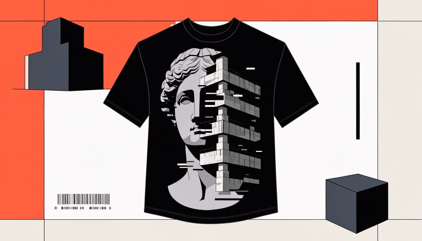
The architectural influence has a real foundation. MoMA's overview of Brutalist architecture describes a postwar style associated with raw concrete, structural clarity, and minimalist aesthetics. On a tee, you translate those qualities into solid blocks, exposed edges, and uncompromising layouts.
The cyber side adds fractured signals, machine-like framing, and a mood shaped by a dystopian future. You can see that vocabulary in Japanese streetwear and in the defining features of cyber-brutalist shirts.
Your design should remain recognizable when you remove the decorative noise. If deleting three glitch overlays destroys the entire concept, the overlays were doing suspicious amounts of unpaid labor.
Start With Brutalist Structure
Before adding effects, build a composition with enough weight to hold them. For a graphic t-shirt, think broad shapes, forceful cropping, and visible empty space.
Borrow Mass, Not Concrete Wallpaper
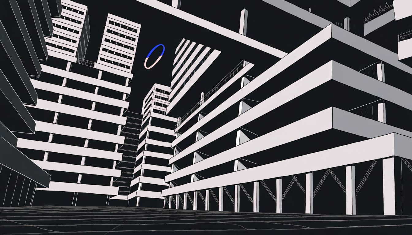
The Washington State Brutalism guide connects the name with béton brut, or rough concrete, and emphasizes heavy mass and scale, ideas still visible in brutalist architecture.
Borrow that scale for brutalist fashion without printing a building photograph across your chest. Use a thick rectangular frame, an oversized slab of type, or a mecha anime-inspired tower silhouette cropped beyond the artwork's edge.
If kanji typography suits the concept, treat it as a structural slab, not random decoration. Keep the shape hierarchy obvious. One dominant block and a smaller counterweight usually give you more presence than evenly spaced industrial icons, a principle familiar from industrial design.
Give Empty Space a Job
Negative space is the unprinted area around and between your graphic elements. It separates the main image from supporting details.
Leave breathing room around a character's face or the strongest word on a garment-ready graphic t-shirt. A narrow gap can interrupt a heavy frame, making the solid areas feel heavier. This kind of restraint works well on techwear t-shirts, too.
You can still look aggressively online while respecting margins. A restrained concrete-gray and black palette suits dark streetwear. Your torso doesn't need the visual density of a motherboard repair manual.
Add Cyberpunk Signals Without Visual Noise
Cyberpunk streetwear works best when a graphic t-shirt gives you a recognizable subject before you decode the surrounding machinery. Choose the emotional center first.
Make Anime and Mecha Imagery Structural
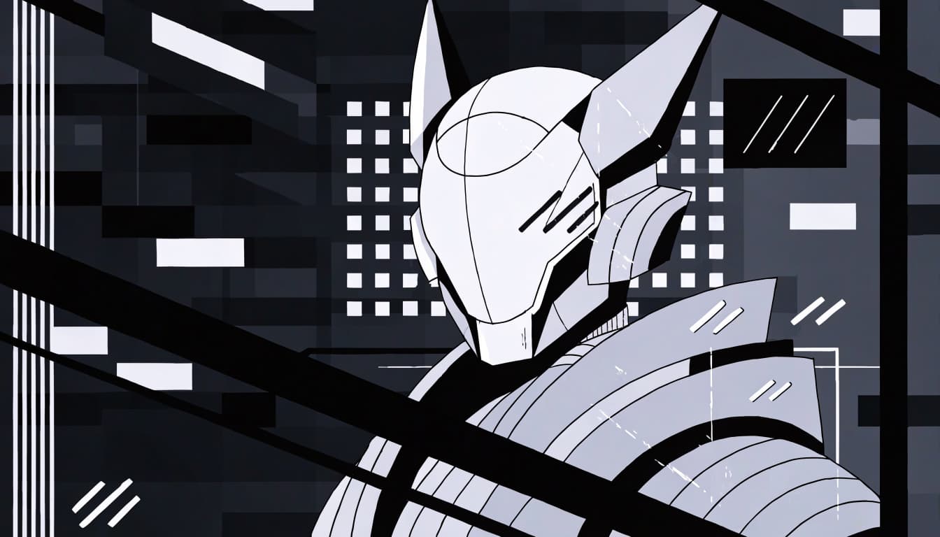
An anime-inspired face gives you expression. Mecha anime brings angular surfaces, mechanical joints, and hard silhouettes that make cybernetic art a natural fit for industrial framing.
Crop around a helmet, eye, or shoulder assembly instead of shrinking an entire battle scene. This tighter view gives sci-fi apparel a clear focal point, while retro futurism details can support the silhouette.
For manga-style artwork and mecha anime, panel borders can become part of the architecture. The differences between anime and manga shirt styles help you choose between color-led character art and ink-heavy compositions.
If you're producing apparel, use original artwork or properly licensed imagery, and check kanji typography carefully when drawing on Japanese streetwear. Fandom literacy doesn't grant reproduction rights. Annoying, but considerably cheaper than discovering that through an invoice.
Distort Selectively
Glitch aesthetics need a target: offset part of an eye, interrupt one silhouette edge, or misalign a few ui elements.
Use high-contrast color, grids, raw textures, pixelation, and stark typography as tools, not a rigid formula. Keep other areas clean so you can see what changed. When every surface is corrupted equally, the image loses its hierarchy.
Vaporwave subculture can add pastel accents, a classical statue, or retro interface shapes. Use synthwave graphics and restrained neon lighting as selective accents, not a full palette. Otherwise, your cyber-brutalist tee may drift into beach-resort screensaver territory, losing its dystopian future edge.
A classical statue works especially well when its smooth contours clash with a rigid architectural grid.
Make Typography Feel Deliberate
Your lettering should belong to the same visual system as the artwork. Condensed capitals, monospaced details, and oversized numerals can suggest machinery and suit a Japanese streetwear look, without requiring an entire fictional operating system.
Choose one dominant type style and one supporting style. Give the headline enough space to read, especially on a graphic t-shirt, then use smaller text as secondary texture.
A short internet-culture joke such as "New Year Same Lag" has an advantage: you can understand it before inspecting the artwork. Keep the punchline readable. Comedy loses some impact when it requires zoom privileges.
Watch letter spacing around distorted words. You can stretch, crop, or interrupt type, but preserve enough recognizable letterforms for the intended message.
Japanese lettering, including kanji typography, deserves the same care: verify its meaning, grammar, and orientation with a fluent reader. Random characters aren't a shortcut to Japanese streetwear credibility, and kanji typography should remain readable.
Treat tiny technical text as optional detail. If the shirt only works after someone reads seven miniature warnings, you've designed a terms-of-service agreement with sleeves.
Build a Graphic That Reads at T-Shirt Distance
A strong cyber-brutalist t-shirt design needs two viewing distances: instant recognition across a room and interesting details up close.
Control Scale and Placement
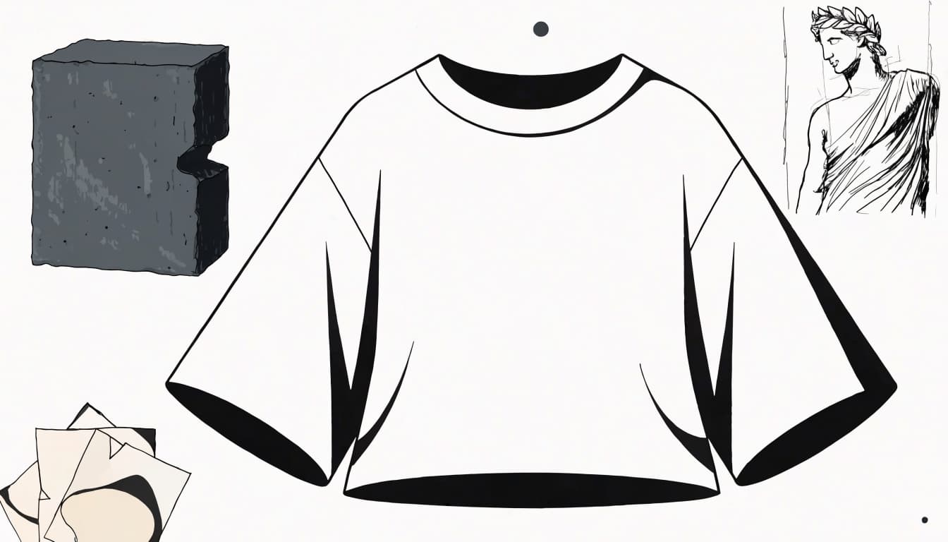
Design on the garment silhouette, not only on an empty canvas. A wide chest graphic, narrow vertical panel, and large back print create different proportions for a graphic t-shirt.
Keep the focal point clear of areas where folds routinely interrupt it. A mecha anime subject or classical statue should retain a recognizable silhouette at a distance.
Check how the design sits beneath an open jacket and whether the main subject remains visible. For a Japanese streetwear look, keep kanji typography large enough to read.
An oversized t-shirt gives you more visual area, but extra fabric isn't permission to enlarge everything indiscriminately. Compare the print's width with the actual garment measurements.
A graphic that looks balanced on a flat mockup can lose its focal point when the shirt folds or sits beneath a jacket.
Test Contrast Before Adding Detail
Start with the main image in grayscale. For cybernetic art, keep circuitry secondary to the focal shape, and don't let glitch aesthetics obscure it.
For a digital mockup, WebAIM's contrast checker helps you compare color pairs. W3C's contrast guidance uses a 4.5:1 minimum for normal web text, but that isn't an apparel-print requirement.
Use those resources to evaluate your online preview, then inspect the actual print separately. Fabric color, ink, texture, and lighting can change what you see on a graphic t-shirt.
Give bright accents a defined role. A retro futurism palette or vaporwave subculture color scheme can guide attention, but competing accents can overwhelm the design.
Check the Print, Not Just the Mockup
Your screen has advantages your shirt doesn't: backlighting, perfect flatness, and the ability to zoom. Judge the artwork at its intended physical size before approving or buying it.
Fine speckles, hairline borders, and delicate gradients need closer inspection than broad silhouettes. Ask for the printer's artwork requirements rather than assuming one file setup works everywhere, especially for graphics featuring industrial design details.
When shopping, look for photos of a finished graphic t-shirt as well as polished mockups. For sci-fi apparel, check whether dark details remain visible and whether the graphic looks consistent across available shirt colors.
When evaluating techwear t-shirts, read the composition and measurement information on the specific listing. A fit name alone won't tell you its width, length, or how it compares with your favorite tee.
Even with futuristic fashion, keep your design judgment separate from marketing adjectives. "Premium" doesn't answer whether the collar sits comfortably or the print feels right against you.
Your apocalypse aesthetic still has to survive laundry day.
Streetwear & Casual Styling
Build your casual look around TrendReactTees.STORE's core signature style: Cyber-Brutalist Anime Graphic Tees. Let the anime graphic on your graphic t-shirt lead, with quieter supporting pieces for a wearable Japanese streetwear look.
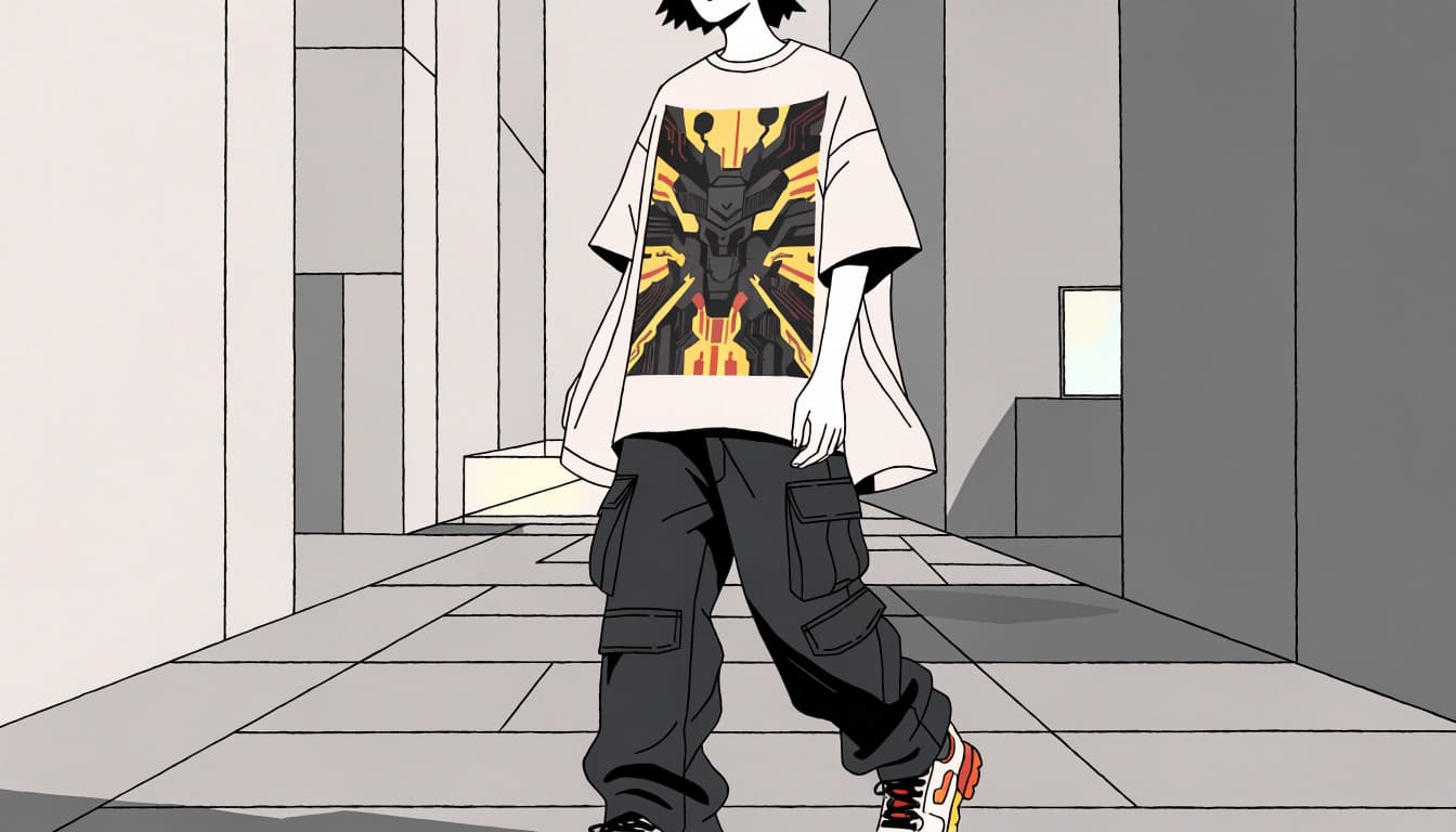
Pair Bold Anime Artwork With Relaxed Bottoms
Relaxed cargos bring a subtle tactical gear influence through practical pockets and shapes, without looking costume-like. Choose black, charcoal, or muted olive to complement a bright mecha anime print and create an urban aesthetic.
Dark-wash denim offers a less utility-heavy option for dark streetwear. Straight or loose legs balance a substantial print, a relaxed approach also seen in Japanese streetwear.
Match one small accessory to a color in the print. If it uses kanji typography or a palette tied to vaporwave subculture, echo just one detail in a shoe or bag for a restrained underground fashion touch. That balance keeps cyberpunk streetwear easy to wear.
For more outfit combinations, the guide to styling anime streetwear covers ways to balance fandom graphics with everyday pieces.
Layer Without Hiding the Artwork
Wear an open overshirt, bomber, or lightweight jacket around a front graphic. Keep the opening wide enough to show the focal point.
If your tee has a large back print, remember that a jacket covers its main feature. Choose your layers according to which side carries the statement.
With an oversized tee, compare the hem and sleeve proportions with your outer layer. Deliberate overlap looks stronger than several garments fighting for the same space.
Choose a Tee You Can Evaluate
When browsing independent sellers or artist storefronts, inspect the whole graphic t-shirt rather than judging a cropped preview. You want to know how the artwork occupies the shirt. For lettering influenced by Japanese streetwear, check how it sits within the full design.
Before ordering, check three things:
- Compare the listed measurements with a tee you already wear comfortably.
- Look for material information, print details, and finished-product photos.
- Read current shipping and refund terms, including how defects, sizing issues, and unwanted orders are handled.
Keep production time separate from transit time when checking delivery information. A dispatch estimate isn't an arrival date.
Buy for a design you'll enjoy wearing beyond one post. If it uses kanji typography, verify the language and meaning. A recognizable silhouette, readable joke, and useful color palette have more wardrobe range than a graphic built entirely around microscopic references, even when it draws on Japanese streetwear.
Frequently Asked Questions
What makes a t-shirt design cyber-brutalist?
It combines brutalist visual weight—such as solid blocks, forceful cropping, and stark layouts—with digital disruption like glitch effects or machine-like framing. A clear focal point keeps the chaos under control.
How do I keep glitch effects from overwhelming the design?
Choose a specific target, such as one eye, a silhouette edge, or a few interface elements, and leave other areas clean. If every part is distorted equally, the graphic loses its visual hierarchy.
What should I check before printing a cyber-brutalist tee?
Inspect the artwork at its intended physical size and ask the printer for its file requirements. Fine lines, small text, dark details, and delicate gradients may not reproduce as clearly on fabric as they do on a screen.
Can I use anime or Japanese lettering in my design?
Use original artwork or imagery you have permission to reproduce. If you include kanji or other Japanese lettering, verify its meaning, grammar, and orientation with a fluent reader.
Make the Chaos Worth Wearing
Your tee stands out when its visual hierarchy survives the effects: a clear subject, heavy structure, and selective disruption.
Choose details that reward a closer look without demanding one. Then pair the graphic with simple pieces that give it space.
You can wear a corrupted transmission across your chest and still look like you meant to get dressed. That's the assignment.