

T-Shirt Print Placement: Front vs. Back for Daily Wear
Your best graphic is doing absolutely nothing if your jacket hides the entire thing. For everyday wear, visibility matters most: front prints work better under open layers, while back prints give larger artwork room when you wear the tee alone.
Plan t-shirt design placement around how you wear a crewneck: a small front graphic works under open layers, while a larger back design suits solo wear. Backpacks and jackets can still cover the back, so get the measurements right.
Key Takeaways
- Front prints stay visible under open layers and work well for face-to-face visibility. Back prints give larger artwork more room when the tee is your outer layer, but jackets and backpacks can cover them.
- On a standard crewneck, start full-front artwork 3 to 3.5 inches below the collar and full-back artwork 2 to 3 inches below it, measuring to the top of the design. Adjust the size to the shirt instead of automatically filling the maximum imprint area.
- Small left-chest graphics are commonly 3 to 4 inches wide or tall, while sleeve designs should fit within the usable sleeve panel. Neckline, fit, pockets, seams, and hood placement all affect where artwork can go.
- Center heat transfers with the shirt flat, a ruler, and equal amounts of fabric over both sides of the platen. Follow the transfer's specified temperature, pressure, and pressing time.
- Match the design and printing method to the fabric, then wash graphic tees inside out in cold water and air-dry when possible to protect the print.
Front-Print vs. Back-Print Tees for Everyday Wear
Front Prints Keep Your Graphic in the Conversation
Choose front placement when you want people to see the artwork face-to-face. Character portraits, compact symbols, and readable jokes work here because the message stays in view while you're talking.
Front graphics also survive an open overshirt or zip hoodie. Keep the design around chest level so your waistband doesn't swallow it.
The trade-off is visual intensity. A huge front illustration dominates your outfit, especially with patterned pants or several accessories. Your shirt has already entered the chat. Everything else can lower its volume.
Back Prints Give Larger Artwork More Space
Choose a back print when you prefer a cleaner front and a bigger reveal as you turn around. Dense anime artwork, stacked panels, and bold compositions benefit from that uninterrupted space.
Back prints work best when the tee is your outermost layer. An open jacket still covers your back, and a backpack can hide most of the design.
For everyday flexibility, a small front mark plus a larger back graphic makes sense. You keep some personality visible without putting the entire lore archive on your chest.
T-Shirt Print Placement Chart
For a standard crewneck, start with STAHLS' print sizing recommendations. These are reference points for design placement, not instructions to fill the maximum imprint area.
Measure collar offsets to the top of the artwork, with the shirt flat and unstretched.
| Garment or Print Zone | Starting Point | Maximum Imprint Area |
|---|---|---|
| Crewneck, full front | 3 to 3.5 inches below the collar | 12 x 14 inches |
| Crewneck, full back | 2 to 3 inches below the collar | 12 x 14 inches |
| Center chest | Common reference: 2 to 4 inches below the neckline | Scale to the artwork and shirt |
| Left chest | 5.5 to 8 inches below the left shoulder seam; 4 to 6 inches left of center | 5 x 5 inches |
| Sleeve | Center within the usable sleeve panel | 3.5 x 3.5 inches |
| Upper-back locker patch | Center beneath the back collar | 4 x 4 inches |
| Across shoulders | Position across the upper back | 4 x 14 inches |
| Inside tag | Place inside the back neckline | 3 x 3 inches |
| Hip | Position above the hem | 5 x 6 inches |
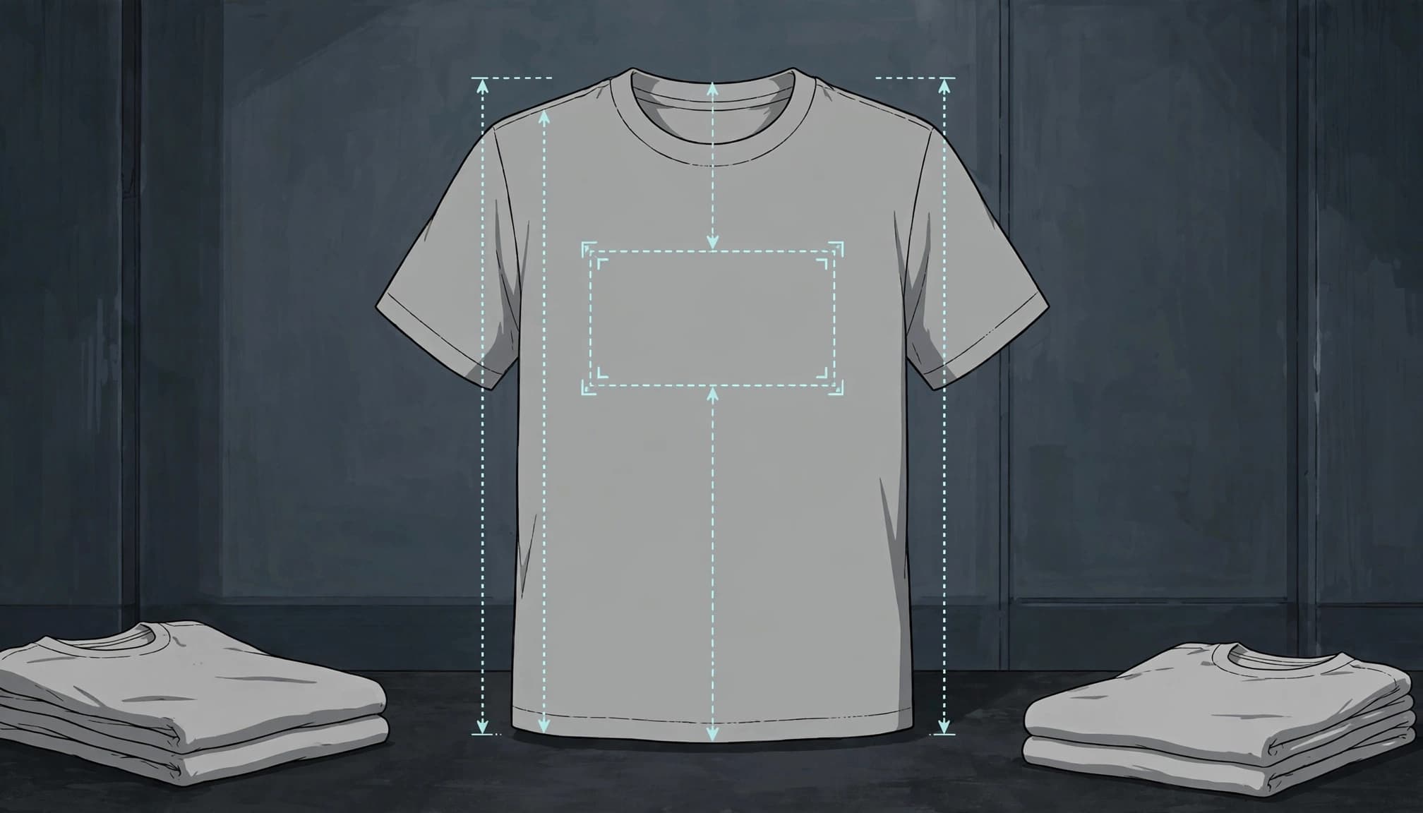
Some recommendations put back artwork 3 to 5 inches below the collar, lower than the chart's back reference. Choose one placement point for the composition rather than averaging different guides.
A 12 x 14-inch maximum imprint area won't suit every size or cut. Reduce the design size for smaller tees; generous blank space often looks more intentional.
Small Chest and Sleeve Prints Keep Things Flexible
Left Chest Logos Work Without Taking Over
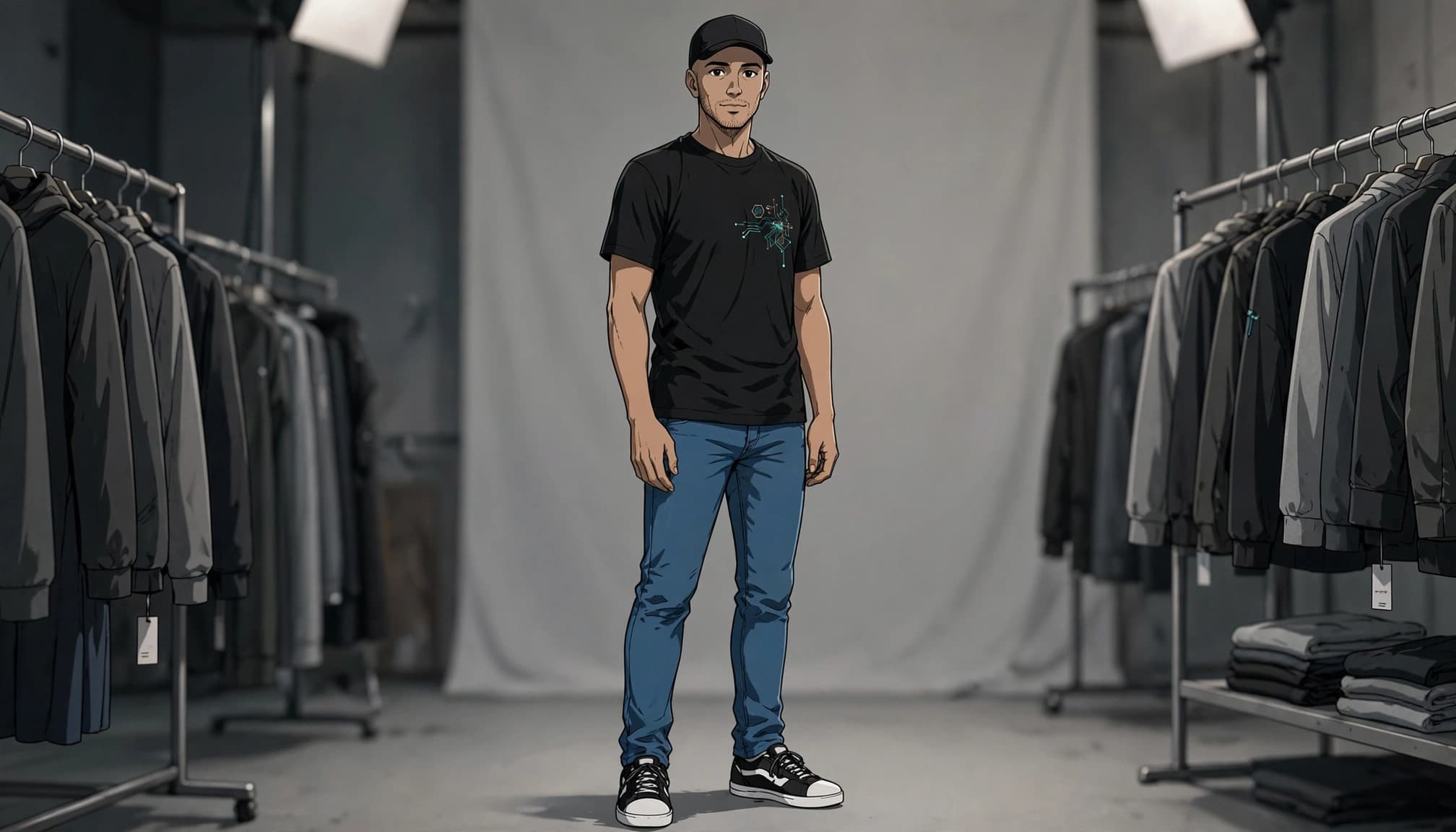
For a restrained, professional-looking result, a left-chest graphic is commonly about 3 to 4 inches wide or tall, depending on its shape. The 5 x 5-inch reference is an available area, not the default logo size.
Position the design on the wearer's left, roughly over the heart, for a left chest print. A narrow emblem and a wide wordmark need different placement to look balanced.
Small designs suit fitted and relaxed tees because they need less uninterrupted fabric. Avoid shrinking detailed artwork until your anime character becomes an unidentified ink cryptid.
Sleeve Prints Add a Secondary Detail
A sleeve print works for a small symbol, short mark, or supporting graphic. Keep it within the 3.5 x 3.5-inch reference area and away from seams.
Consider the sleeve shape. A short fitted sleeve offers less usable space than a roomy drop-shoulder cut.
Use this zone as an accent. Your sleeve doesn't need its own season finale.
Adjust Placement for Your Neckline and Fit
V-neck and Scoop Necks Need a Higher Starting Point
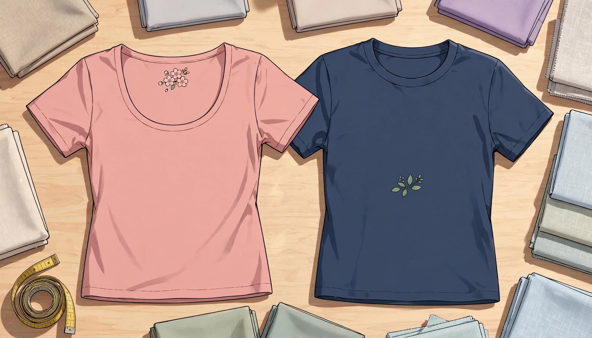
On V-neck and scoop-neck shirts, move the artwork closer to the neckline than you would on a crewneck. Using the same 3 to 3.5-inch offset on a V-neck with a deeper opening can push the design too low.
There's no universal replacement distance because neckline depth varies. Keep the artwork within the upper-chest fabric and clear of the neckline seam.
STAHLS' garment placement guide covers different cuts. For placement, follow the garment's shape instead of copying a crewneck template.
Fit Determines Whether the Artwork Stays Readable
A large graphic needs relatively flat fabric. Too tight, and the artwork stretches across your chest. Excessively oversized, and it can disappear into folds.
Regular or moderately oversized fits are useful starting points for large front prints. Our graphic tee fit guide breaks down chest width, shoulders, and length.
For crop tops, shorten the artwork before lowering it toward the hem. On tanks and racerbacks, keep the design inside the narrower fabric panel and clear of armholes.
Pocket Tees and Hoodies Need Different Layouts
Give Pocket Prints Some Breathing Room
For a pocket tee, leave visible space around the design rather than filling the pocket edge-to-edge. A smaller symbol usually reads cleaner than artwork squeezed against every seam.
Printing above the pocket is another option. Keep the graphic separate enough that the pocket doesn't look like it accidentally collided with the design.
A pocket changes the usable print surface. Treat its seams and raised edges as boundaries, especially for heat transfers.
Keep Hoodie Artwork Clear of the Hood
A resting hood covers the upper back. If your design starts near the collar, important artwork can disappear beneath it.
Left-chest and sleeve placements avoid that problem. A back graphic can still work lower down, provided the hood doesn't conceal its focal point.
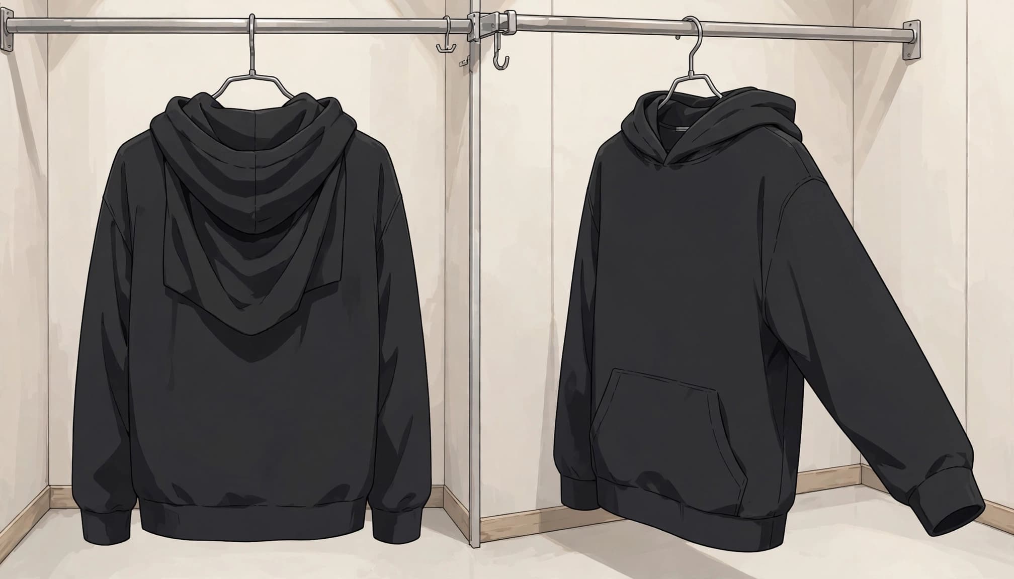
On the front, keep artwork clear of the pouch pocket and zipper. Those features interrupt both the composition and the flat printing surface.
Measure and Center a Heat Transfer
Good t-shirt print placement starts with a ruler. The three-to-four-finger method gives you a rough crewneck starting point, but hand sizes vary. Your fingers are not calibrated equipment.
For a standard front transfer:
- Lay the shirt flat and smooth it without stretching the fabric.
- Find the garment's centerline, then use a ruler to measure 3 to 3.5 inches below the collar and mark the artwork's top edge.
- Load the shirt onto the lower platen with the armpit seams hanging equal amounts of fabric over both sides.
- Align the artwork with your marks, recheck its position with a ruler, and keep bulky seams outside the pressing area.
Equal fabric over both sides helps center the garment. It doesn't replace measuring the artwork's position.
For sleeves and unusual zones, Hotronix quick-change platen guidance shows how interchangeable lower platens make awkward areas easier to access.
Use the heat transfer's specified temperature, pressure, and pressing time. Placement measurements don't tell you how much heat the material needs.
Match Your Fabric to Your Printing Method
Stretchy spandex can change the artwork's shape as the garment stretches. Smaller graphics and simpler compositions reduce visible distortion. Fine lines across a tightly stretched chest are signing up for unnecessary drama.
Ribbed cotton has a textured surface, so bold, simple graphics generally read more clearly than tiny details.
Screen printing is a strong option for simpler designs with limited colors. Embroidery suits compact, simplified logos and small decorative details, although tiny lettering still needs enough space to remain readable.
Direct-to-garment printing (DTG) suits detailed, multicolored artwork and gradients. It makes sense for illustration-heavy designs that would require numerous separate screen-print colors.
Our tees use Bella Canvas 3001 blanks. Whatever blank you choose, match the artwork to its size and fabric instead of assuming placement alone will solve everything.
Streetwear & Casual Styling
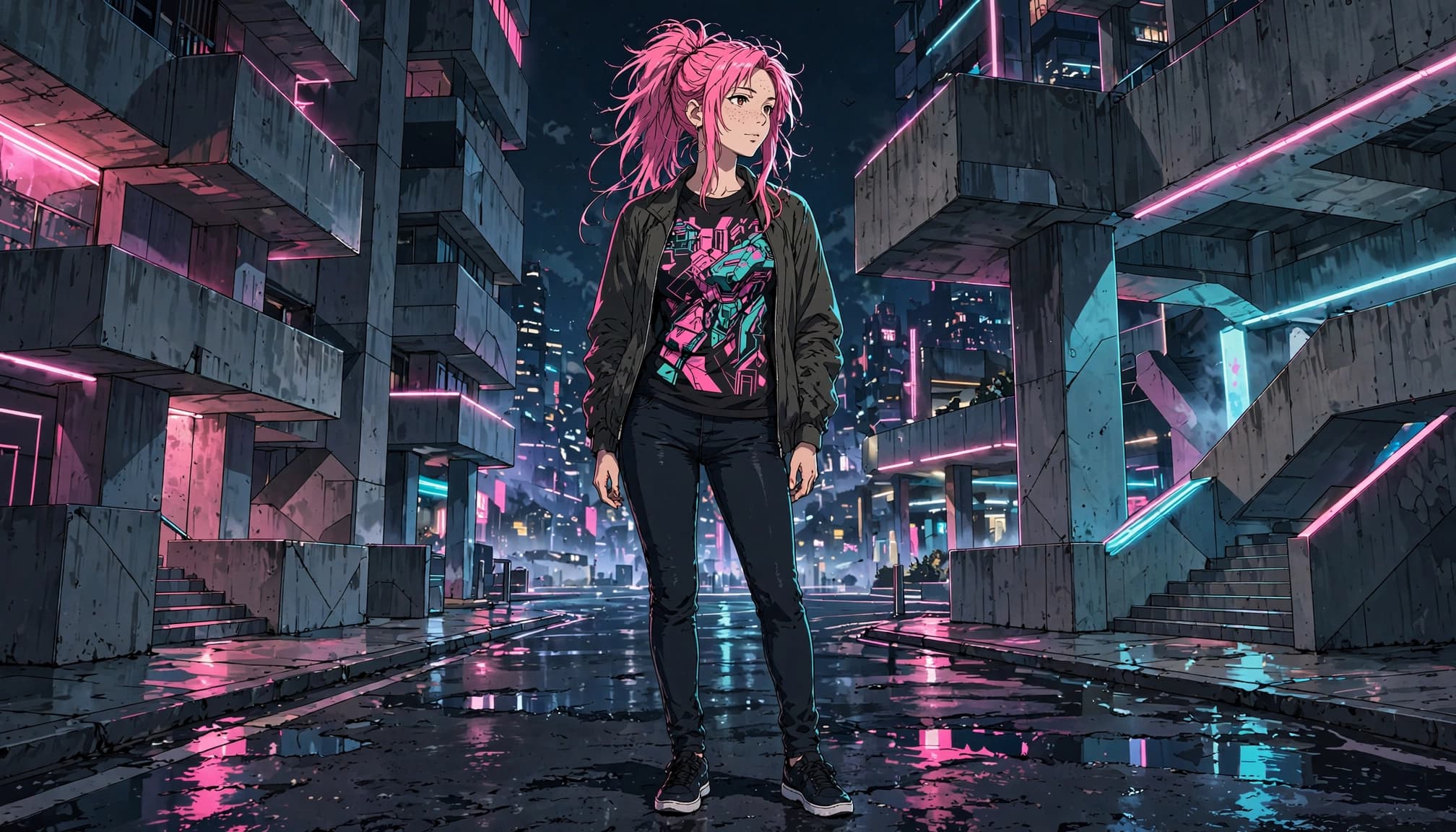
Our Cyber-Brutalist Anime Graphic Tees already bring bold artwork, sharp contrast, and internet-culture energy. Build the rest of your look around the print's location, then give it enough room to stay visible.
Build Around a Front Graphic
Pair a bold front print with relaxed cargos or dark-wash denim. Add mostly solid outerwear so the artwork remains the focal point.
An open bomber, utility jacket, or overshirt frames a chest-level design. Keep necklaces clear of character faces and important text. Position a crossbody bag low enough that its strap doesn't censor the punch line.
A light front tuck works when the artwork sits higher. Leave enough fabric loose to preserve the full design. Our cyber-brutalist tee styling ideas offer more ways to balance graphic-heavy outfits.
Let a Back Print Stay Visible
For large back artwork, wear the tee as your outer layer with denim, cargos, or simple shorts. Keep the silhouette roomy enough that the illustration doesn't bunch across your shoulders.
If you're choosing between oversized and fitted shirts, consider both print scale and body length. Extra width helps larger artwork; excessive length can drag the whole composition downward.
Carry a smaller bag when you want the back graphic visible. A full backpack turns your carefully chosen artwork into hidden bonus content.
Keep Both Sides Looking Sharp
Front and back prints need the same low-drama care: wash inside out in cold water with mild detergent. Choose a gentle cycle and separate graphic tees from rough denim, towels, and exposed zippers.
Skip bleach and fabric softener. Air-dry when possible, or use low dryer heat without overloading the drum.
Don't iron directly over the artwork. Turn the shirt inside out and use low heat on the reverse, with a thin cotton cloth for extra protection.
High heat won't improve placement. It can shrink the garment and damage the print you worked to position.
Frequently Asked Questions
Should I choose a front print or a back print for everyday wear?
Choose a front print if you want the graphic visible while talking or under an open overshirt or zip hoodie. A back print gives larger artwork more space, but it works best when the tee is your outer layer and isn't covered by a backpack.
How far below the collar should a crewneck print sit?
For full-front artwork, start 3 to 3.5 inches below the collar; for a full-back design, start 2 to 3 inches below it. Measure to the top of the artwork with the shirt flat and unstretched, and choose one placement point rather than averaging different guides.
How should I place a graphic on a V-neck or scoop-neck shirt?
Move the artwork higher than you would on a crewneck, keeping it on the upper-chest fabric and clear of the neckline seam. The right distance depends on the depth of the neckline, so a single crewneck measurement won't fit every shirt.
How do I center a heat transfer on a shirt?
Lay the shirt flat without stretching it, find the centerline, and use a ruler to mark where the top of the artwork should sit. Load the shirt so equal amounts of fabric hang over both sides of the platen, then recheck the artwork's position before pressing.
Choose the Layout You'll Wear
Choose front printing if open layers and face-to-face visibility dominate your routine. Choose a back print when you wear tees uncovered and want larger artwork with a cleaner front.
For both, pair a compact chest graphic with a bigger back design. Keep the placement proportional to the garment and leave the important artwork clear of seams, straps, and waistbands.
Your graphic deserves screen time. Dress accordingly.